Redesigning Taco Bell's Navigation for a Seamless Experiencce
Taco Bell’s website navigation had remained unchanged for nearly two decades, highlighting the need for an update. The goal was to simplify navigation by removing redundancies identified through data analysis and to enhance the user experience by emphasizing the brand and its innovative features.
The existing setup featured both a left-hand navigation menu and a top menu bar. This project aimed to consolidate these into a single top navigation bar, thus creating space for marketing promotions and streamlining the user interface. On mobile devices, the dual-menu configuration—particularly after login—had led to user confusion, as expanding content displaced existing elements and further complicated navigation.
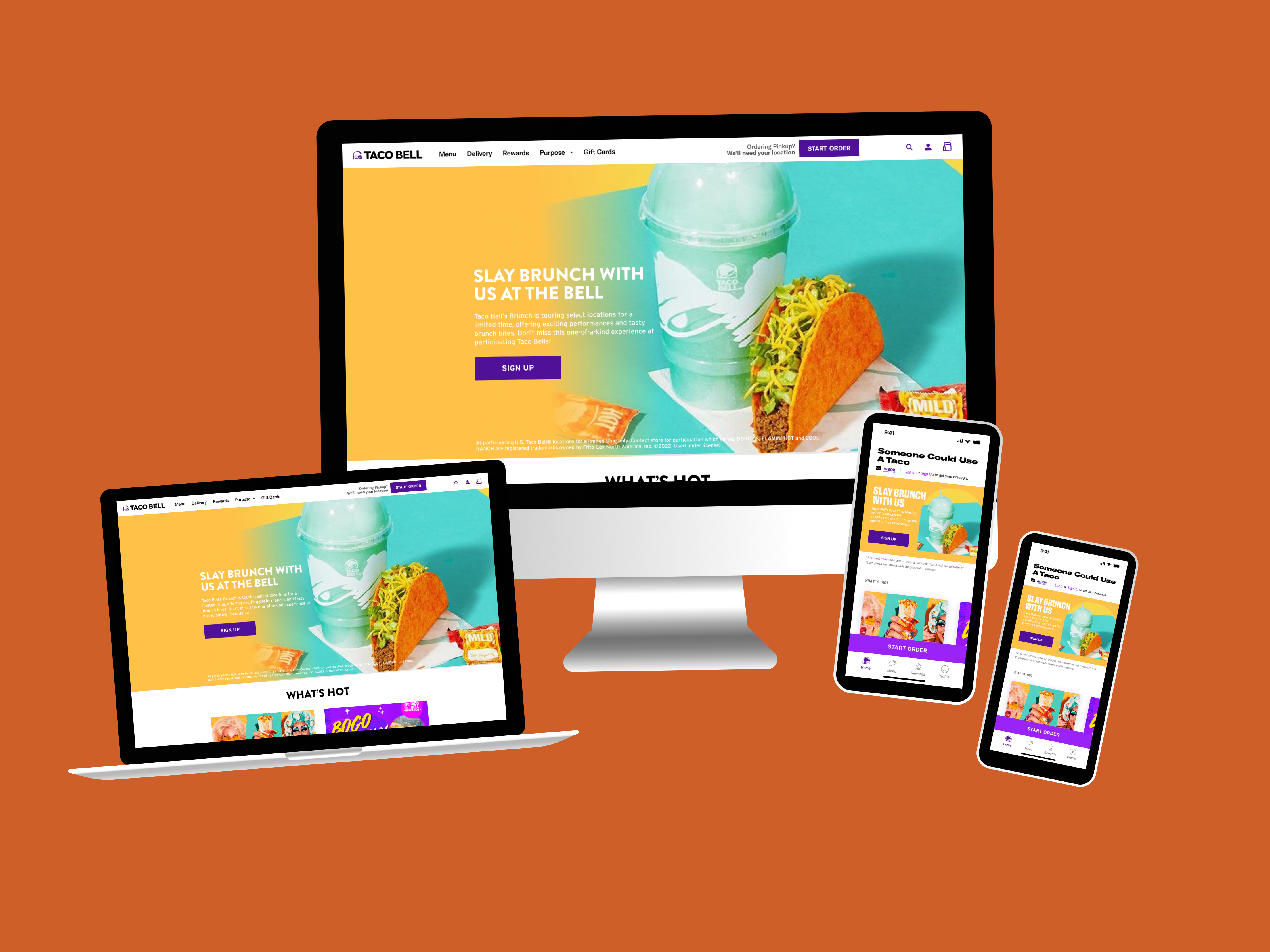
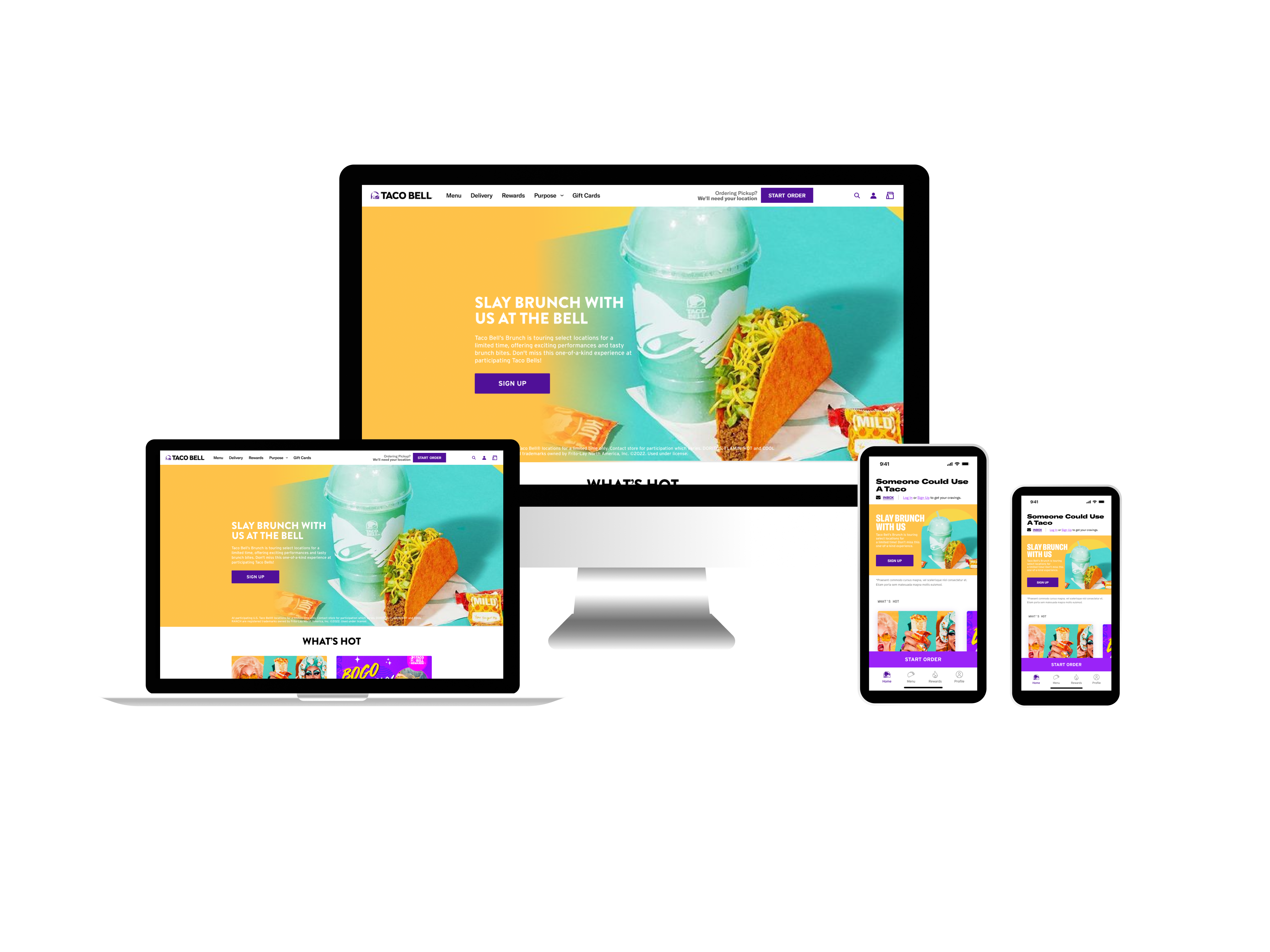
The final deliverables consisted of responsive wireframes for both web and mobile platforms, incorporating updated top navigation and footer designs across all Taco Bell pages. These designs addressed various states, including logged in, logged out, active, hover, and mobile long press gestures. The designs were also compatible with existing features, such as submenu screens. Throughout the project, I worked closely with product managers, analytics, and engineering. The revamped navigation system, which launched in Q3 of 2024, significantly improved user navigation and order placement.
Understanding Our User's Behavior
To kick off this project, I reviewed analytics from the research team to guide the wireframes with benchmarks and prepare for A/B testing of both legacy and new navigation designs. Given that 99% of web revenue comes from mobile devices, we emphasized a mobile-first approach.
Key Insights Included:
Key Insights Included:
User and Revenue Focus: Mobile users account for 99% of web traffic and revenue, with a mobile conversion rate of 20.1% compared to 5.7% on desktop. The average order value on mobile web is lower compared to desktop.
Loyalty and Sign-Up Opportunities: Loyalty mobile users convert 6x more than guests, indicating a strong opportunity to increase sign-ups. Additionally, 87% of mobile revenue comes from logged-in users, compared to 98% of desktop users being guests.
Reviewing Competitors to Understand QSR Wayfinding
When reviewing competitor experiences, several trends became evident. Most QSR companies featured slide-out menus that showcased their brand and personality in a clean, simplified manner. Many links were consolidated into dropdown menus.
While they effectively promoted sign-up and join-now options, they often fell short in highlighting reward programs. This presented an opportunity for Taco Bell to gain an edge by better showcasing rewards and attracting more users.
Additionally, competitors’ footers were highly branded, often including elements like KFC’s smiling Colonel. These footers, though text-heavy, were organized into dropdown menus similar to the main navigation. In contrast, Taco Bell’s current design makes it more time-consuming to navigate through links, from menu options at the top to legal links at the bottom.
Design Revisions and Iterations
In the design iterations, I presented several footer options to stakeholders: one with all text and another more image-focused. We ultimately chose a design that balanced both approaches, incorporating Taco Bell's signature purple and featuring imagery of our iconic hot sauce packets to reflect the hot and fire reward tiers.
The footer was significantly streamlined, and the top menu was reorganized to remove duplicate icons and links. A "Rewards" tab was added to the slide-out menu for the app, and profile and cart icons were updated to align with new brand guidelines. Stakeholders preferred the full-view menu with the new color scheme and emphasized prioritizing the "Sign Up" and "Log In" buttons to better serve our predominantly guest mobile users.
Results
The global navigation and footer, launched in September 2024, received positive feedback and resulted in a +20% increase in overall shopping flow from the navigation. Users who engaged with the new navigation were 15% more likely to add items to their cart compared to the previous design.
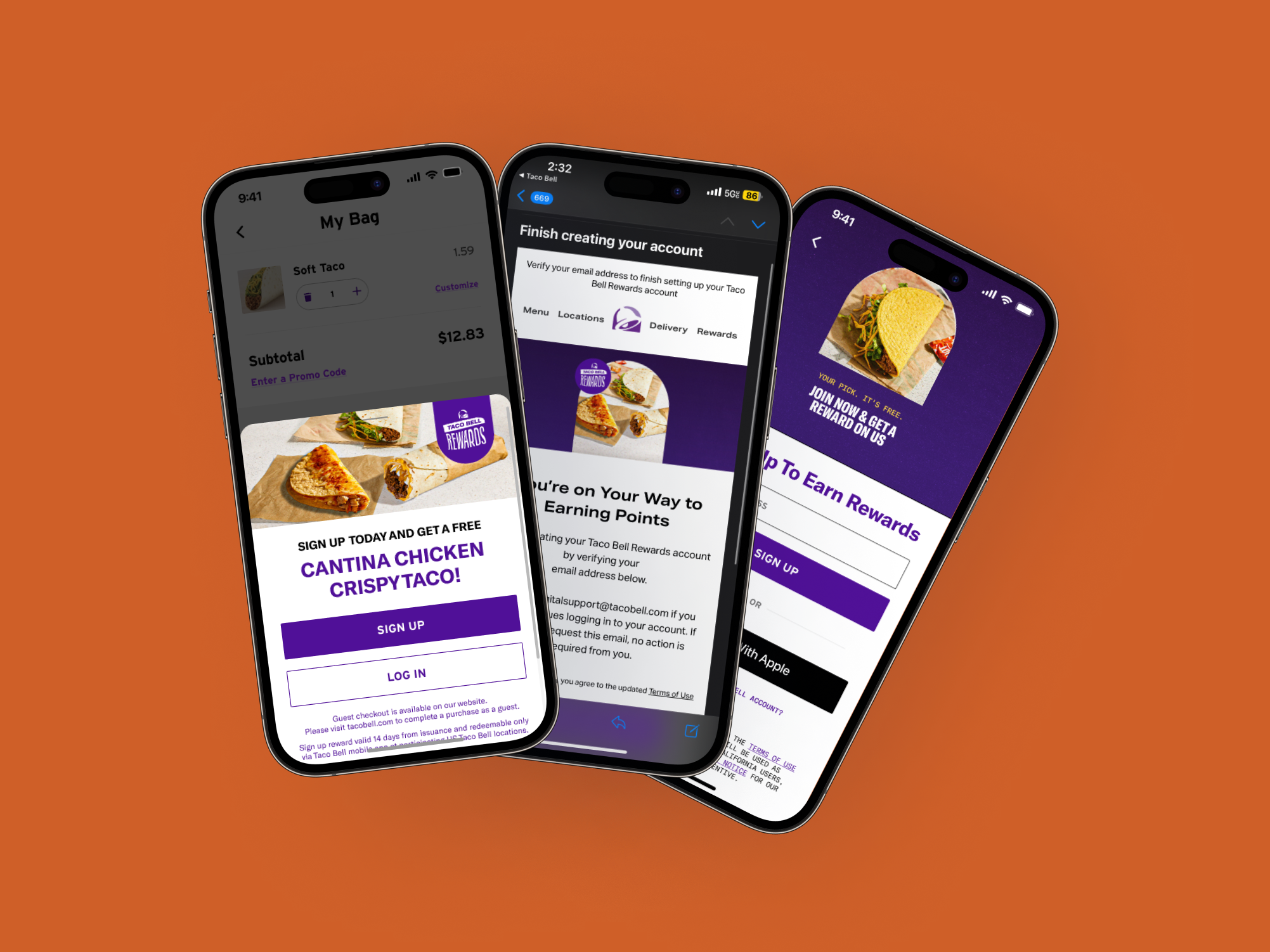
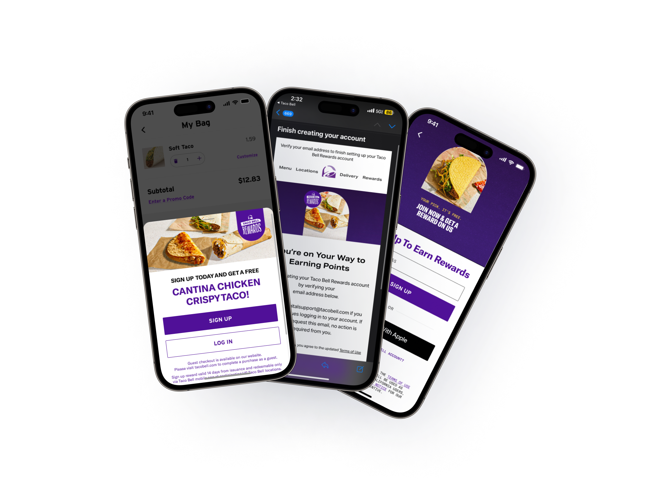
Additionally, the introduction of new “Sign Up” and “Log In” buttons in the navigation menu led to a 4% increase in guest users signing up. There was also a 7% rise in users who signed up on the web and subsequently appeared in the app.
